As I continue to work through my images files from this year’s trip to Japan and posting images to the website and blog, I have become aware of and frustrated by, inconsistencies in image quality as viewed on the web. The issue became apparent as I was working my way through some of my snow monkey images. These fascinating primates have brightly coloured faces which I believe I managed to capture faithfully in camera and then carefully process in software before outputting to jpeg for web display. The problem arises when I bring those images into the website and view them through my web browser of choice, Firefox. The images appear on the web as lacking in both contrast and colour saturation, in a word, insipid!
Animated GIF – allow to play
Obviously, I wanted to find out the reason for this as I hadn’t noticed the effect until recently and couldn’t find any reference to it elsewhere on the net. I started going through the possible variables involved. The monitor I’m using is calibrated and colour accurate and in any event, I’m viewing the prepared jpegs on my computer and on the web on the same screen. Check quality settings on jpeg output, at different quality settings and image sizes the issue is still apparent, indeed not influenced at all. Check to see if the WordPress publishing system is influencing the results by posting the same images on other non-WordPress websites, eg; Facebook and Google Plus. Again no change, the images look equally as insipid on Facebook, etc. Could there be some software conflict within my WordPress installation? Turned off several of my WordPress plugins, no change.
This led me to wonder if the web browser itself, Firefox, was the issue, so I installed Google Chrome and opened the same pages and images. The same problem, images look just as insipid in Chrome as Firefox. I then checked the images as viewed on a mobile phone using Firefox, the images which looked lousy on the monitor screen looked fine on the mobile device, colour, and contrast as I would intend them. So what’s happening here? Could it be that web browsers are now being developed and tweaked with mobile device displays in mind at the expense of accurate PC monitor display?
Another variable could be the operating system itself, I’m using Windows 10 and don’t have access to a Mac, I’d be interested to know if anyone else has observed this issue on either system. For the time being, I’m at a loss to explain it, I only know what I’m seeing and it’s disappointing.
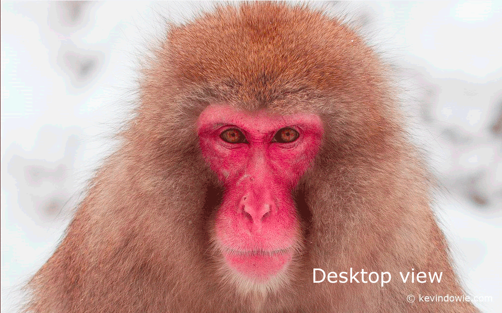
To illustrate the point, I opened one of the images in both my web browser and on the desktop, taking a screen capture from each. The animated GIF below indicates the differences. Yes, I realize that given all I’ve said above, how you see the image(s) on your screen (desktop or mobile device) is problematic, but what should be obvious is the drop in colour saturation and contrast when going from desktop view to browser view. The processing of the two screengrabs was identical.
If anyone has any ideas or experience in this area I’d love to hear from you.
On a lighter note:
The stuff people search for!
As I recently posted on Facebook;
I can’t help but laugh. In running my website, I use an analytics plugin to get some idea of how and why people visit the site. One of the interesting things is to see what search terms people use to arrive at the site. Recently people have looked for terms such as “Hong Kong by night”, “Tin Hau Temple”, “Whooper swans” etc, which all make sense as I’ve posted stuff that’s relevant to those terms. I can’t believe that people search for terms such as “kevindowie nude videos” though! What the hell do people imagine I get up to??? LOL. PS: don’t bother searching the above term, you’ll only be disappointed…. 🙂 KD