One of the things which I did (and most visitors to Honolulu do) whilst in Honolulu was to take in the views from Diamond Head. A city bus is an easy enough way to get to the Diamond Head State Park and from there a fairly easy hike to the top of the crater rim where a lookout provides some good views back to the west to Honolulu itself and east towards Koko Head.
The images presented here were all taken with the Canon 5d Mark2 and the 24-105mm zoom. The park is heavily touristed (is that a real word?) with people of all ages making the walk up. For safety reasons, the park closes at sunset which is understandable as one section involves a steep set of stairs and of course is unlit. The downside of that is that you have to pack up your camera and make your way out of the park before the best light of the day occurs. No chance of a sunset shot from the lookout.

Experiments with Split Toning.
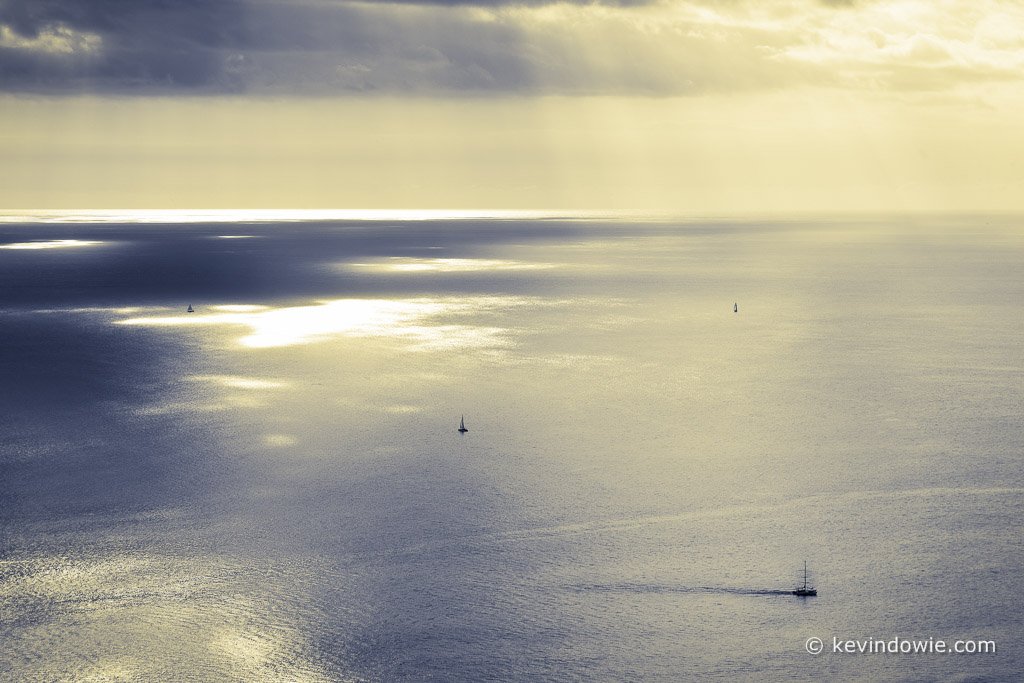
One of the things that I’ve been experimenting with lately is the split toning function within Adobe Lightroom. The image presented below is a split toned black and white. There were several processing steps as follows:
lens correction. Taken at 105mm there was some linear distortion (pincushion)…most obvious in the horizon line.
Cloning. I wasn’t pleased with the position of the boat in the bottom right corner (damned boat captain sailed off course!) the boat ended up too close to the edge of the frame and so I moved it up (sorry to the “minimal manipulation” purists out there)
Converted to black and white. If you saw the original you’d see there wasn’t much colour in the image anyway.
Split toned introducing a yellow tone into the highlights and a blue tone into the shadow areas.
Slight vignette
Text (copyright reminder) and digital sharpening.

With digital, the possibilities with split toning are almost infinite. In the old days (well not that long ago) when we were using film, tonings were achieved at the printing stage. The black and white print was placed in a chemical bath which imparted the colour toning effect the intensity of which was determined by how long the print was left in the chemical bath. Messy, hard to control and sometimes toxic as well.
Now with Lightroom and or Photoshop, you can control the effect with great precision and repeatability. Whilst you can of course give a single toning effect to the whole image, and if you wish, mimic a traditional sepia, brown toning, cyanotype? etc, one of the cool things is that you can dial in different colours to effect highlights and shadows separately. In this case, I chose a yellowish tone for the highlights and a bluish tone for the shadows. I think this provides an interesting balance given that yellow/blue are “complimentary” or perhaps more correctly, “contrasting” colours.
Like so many things, it really is a matter of personal taste just how far to go with such effects and obviously, the approach works better with some images than others.
It’s Digital, not Traditional!
As I said, if you wish, you can “mimic” traditional effects. Indeed there are Photoshop plugins, actions, internet tutorials, etc, which promise you a “sepia” effect or a “cross-processed” effect and so on. Over the years people got used to looking at fairly familiar photo effects like that, the temptation for some people now with digital is to ask themselves “how can I replicate a traditional (sepia, brown tone, platinum etc) effect?”
Perhaps also an audience expects the digital image to in some way conform to tradition. I recall some time ago showing an image to someone and their reaction was to give it a cursory glance and then declare “it’s too yellow!” and walk away. Only after the event did I stop and think….hang on….” too yellow” for what? If the answer is too yellow for the viewer’s personal taste, then I’d suggest that’s one person’s valid opinion. However, it occurred to me that what might be meant, even if only subconsciously, was, it’s “too yellow” ….to be considered a traditional sepia tone! Therein lies the difference in thinking. It’s digital, not traditional and digital doesn’t need to imitate tradition. (How’s that for profound! You may quote me!)
To labour the point, imagine your beloved pet “Rover” the cattle dog dies. You go down to the pet shop and you buy yourself a new dog, a rottweiler pup. As it grows up you look at the rottweiler and you sigh “it’s not a cattle dog”. Well, no it’s not, it’s a different breed, but hey, it can fetch a stick too!
Next Blog Post.
In my next post, I’ll continue my journey through the Hawaiian Islands and also further explore some more ideas on photo processing and, I promise, no more ranting about dogs! ~KD
