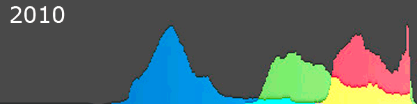
2010 to 2012
A cautionary tale! Just because you can, or are invited/prompted to, update software, doesn’t mean you should jump in and do so. How often is software released or upgraded with all sorts of bugs and malfunctions? Answer, all the time. There is a line of thinking that it’s best to stay with software versions that are one or two behind the “latest and greatest” to ensure maximum reliability. It never fails to amaze me that the computer and software industries can release some of the stuff they do and get away with it. Flaky product performance that wouldn’t be tolerated elsewhere. Imagine if you were driving your car and for no apparent reason it suddenly stopped working, then a message comes up on the dashboard telling you to reboot the engine or contact tech support!
What has this got to do with digital image processing? Well, a little while back I was going through some of my images in Lightroom (version 5, not the creative cloud!) when I reviewed some images I’d processed using the 2010 process version. I then realized that there had been an update to the processing algorithms in 2012 and so thought…. probably should look at what the 2012 process does. Will it give me better noise suppression? That would be nice. Well the result, whilst I’d hardly call it a bug or malfunction, was surprising. Apart from anything else, there was an obvious change in how it handled some colours within an image.
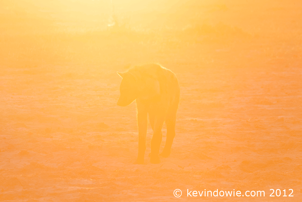
Below I’ve posted an animated GIF showing the difference in a hyena image from my Botswana files. (Please allow a moment for the GIF to load) This might be considered a special case, a strongly back-lit subject in very warm end of the day light. None the less it’s illustrative. The image had very few adjustments done to it, almost straight out of the camera, the difference shown is due purely to the change in process version.
A closer look at the histograms.
Looking at the histograms generated by the processes gives an idea of what’s happening here. Notice the right side, or top end, of the histogram. It’s obvious that the red and green values have been pulled down. The yellow in the histogram represents the red/green overlap and is the most obvious effect in the image above.
So what’s the take-home point of this? Don’t just instinctively update/upgrade something simply because it’s available so easily. If I wished, I could experiment with the sliders and get a very similar result with either version, but imagine if for some reason you were tempted to select a batch of previously processed images and “update” them. Oops! ~KD.