Menu
Blog
Blog Archive
Image Galleries
Multimedia
Subscribe
About/Contact
About
Contact
Photo sales and licensing
Copyright
Privacy Policy
Blog
Blog Archive
Image Galleries
Multimedia
Subscribe
About/Contact
About
Contact
Photo sales and licensing
Copyright
Privacy Policy
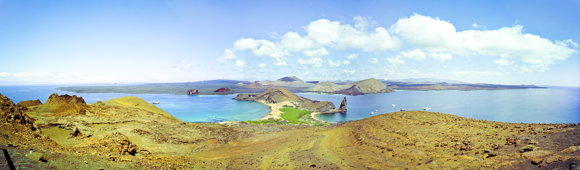
galapagos islands panorama
Galapagos Islands panorama
Share