
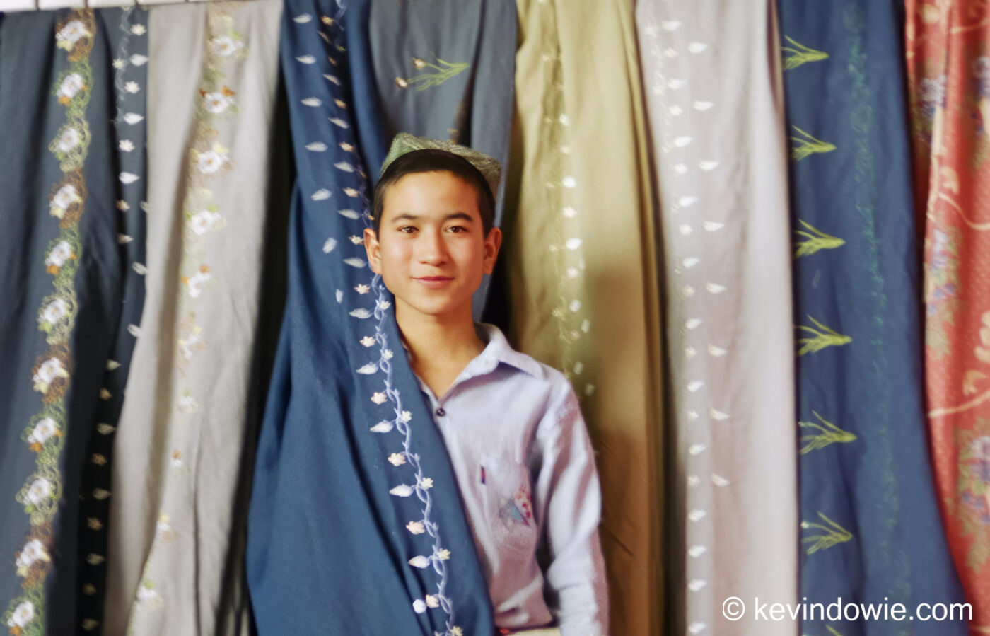
Published on the last day of each month, the “Unloved photo” highlights a previously ignored image drawn from my archives. This photograph is part of the USA image gallery. ~KD.
Published on the last day of each month, the “Unloved photo” highlights a previously ignored image drawn from my archives. This photograph is part of the USA image gallery. ~KD.
There is little doubt that A.I. (Artificial Intelligence) is having a profound (and growing) influence on our lives and our society with great concerns about it’s use and more particularly its abuse! Like any tool or new technology, there are trade offs between positive and negative effects dependent on the motives of those using the technology. It’s always been that way! A can of petrol can power a car and get us from point A to point B, or it […]
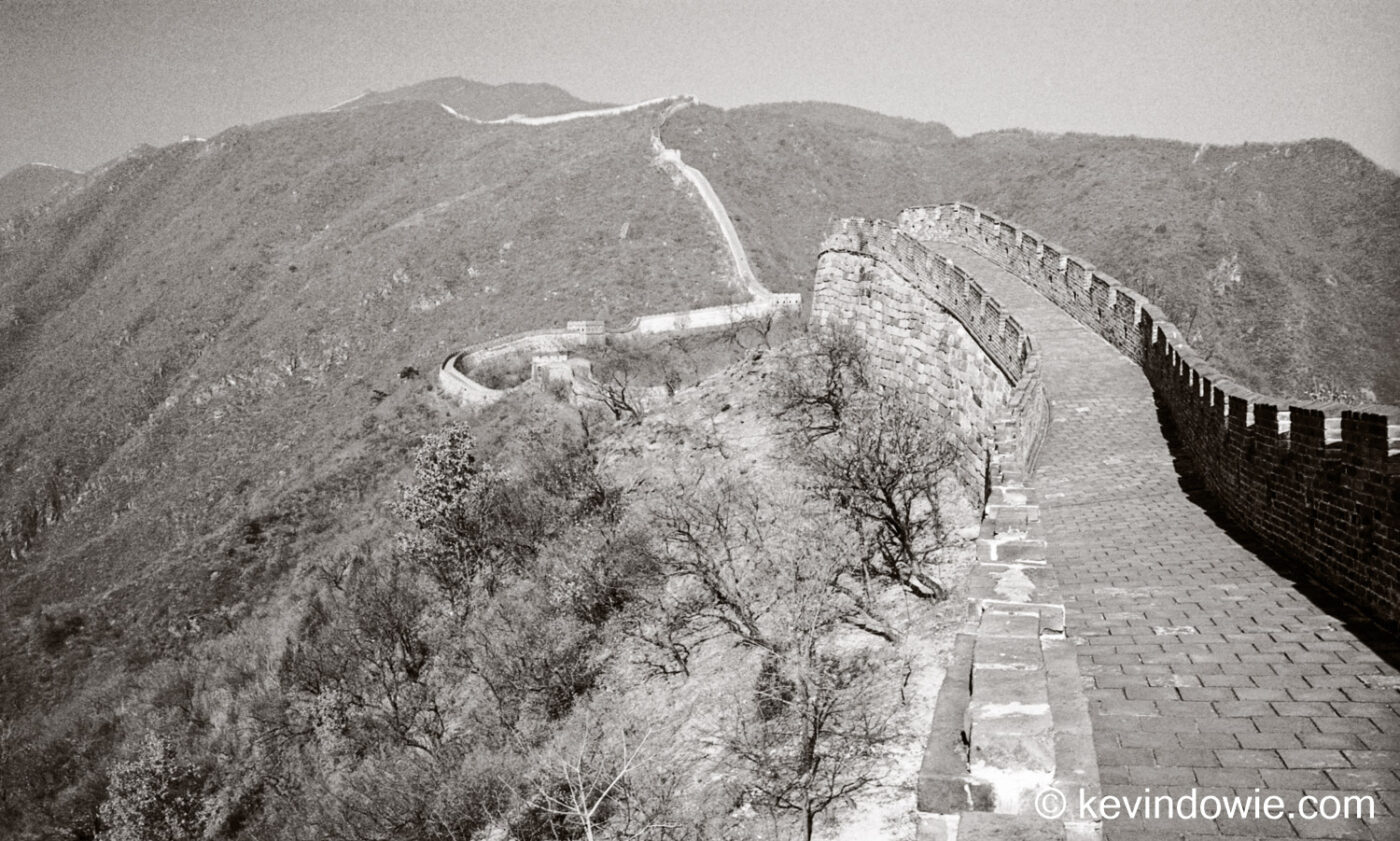
Following on from last post, I present the same series of images only this time in monochrome. I have chosen to use a sepia toning at a slightly higher strength to previously, in this case I think it works well. Visible from Space? How many times have we heard that the Great Wall of China is the only man made structure visible from space? This statement has been repeated so many times that many people are unshakeable in believing it. […]

Looking back through my Lightroom catalogue, I rediscover some images from way back in 1999, taken at the Great Wall of China. The images were taken on 35mm colour negative film and later scanned into the computer where I took advantage of today’s photo editing software to enhance them. It’s a worthwhile exercise to revisit such images as our photo editing skills and tastes change over the years. I’m quite sure these pictures are different to what I might […]
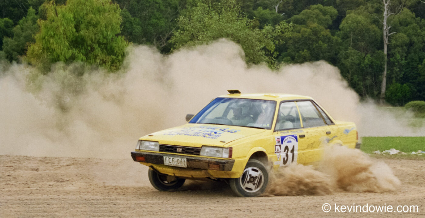
Today I’m digging into my photo archives to rediscover some images captured way back in 1990! Who needs a time machine? The occasion was a rally car event held in the Yarra Valley outside of Melbourne. As I recall, the event was in three stages, one being on gravel roads (temporarily closed to regular traffic) out of town and through the surrounding bushland. Another being around a sports reserve and the immediate area with a third being around one of […]

A visit to an historic gold mine in regional Victoria. The mine has long ceased operations but the ghosts may still be present! They left their clothes hanging in the old change room….
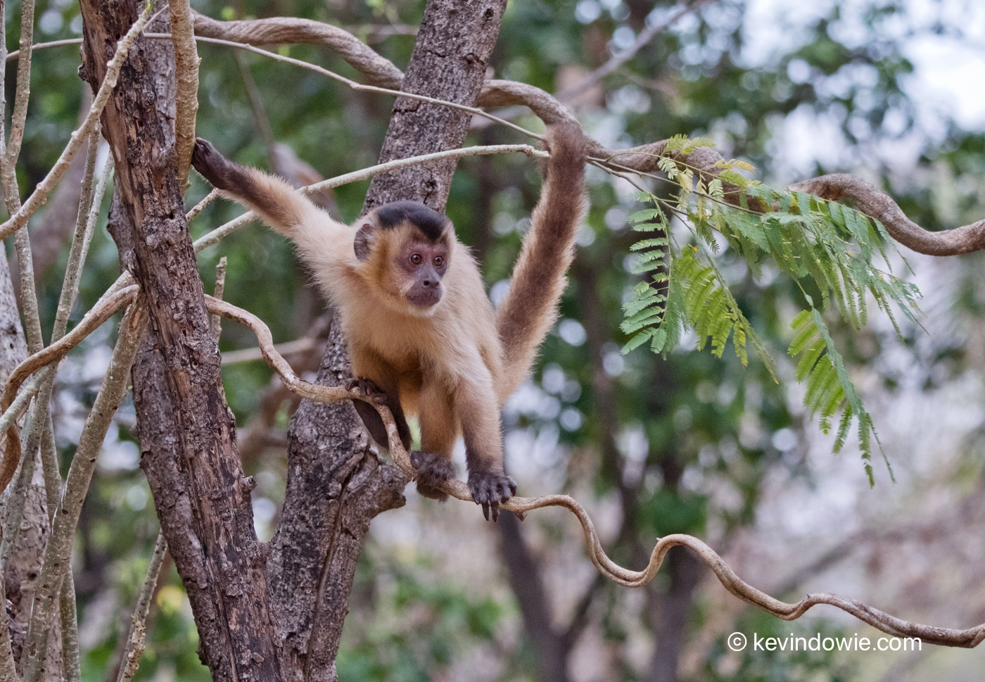
The capuchin is considered a “New World” monkey being distributed throughout Central and South America. There are numerous sub-species (with dispute among naturalists as to naming conventions and the actual numbers) across 2 genus. This individual was photographed early morning close to our lodgings in Brazil’s Pantanal region.

Floating along the rivers and channels of the Pantanal, Caiman are seen in large numbers. Family portrait? Caiman were often seen motionlesss on the river banks, jaws open to regulate the animals body temperature. Fly crawling on caiman. Notice one of the teeth from the lower jaw visible through a hole in the edge of the upper snout. Fly on Caiman Adorned with swamp vegetation.

The Yellow-billed Cardinal (Paroaria capitata), photographed in Brazil’s Pantanal region, where it is a common sight. A species in the Thraupidae or Tanager family, it is also found in the neighbouring countries of Paraguay, Bolivia, Uruguay, and the northern parts of Argentina. Despite its common name, it is not very closely related to the Cardinals of the Cardinalidae family which have a wider distribution into North America. These birds were photographed early morning requiring ISO 2000, not a […]

The Clarke family: The mystery that never was. As reported on Petapixel (and elsewhere) large numbers of people were completely fooled by the story of a family that supposedly vanished only to be uncovered later entombed in a makeshift brick structure. The story was entirely fictional being generated, complete with convincing “photographs”, by artificial intelligence. From Petapixel – AI image of Clarke family fools internet I see so many people uncritically parroting nonsense online, it is so easy to […]